

I grew up in the era of Gretzky silver and black. The Purple and Gold uniforms were great, but with Wayne Gretzky in town, it was time for the Kings to forge a new identity. The Silver and Black were perfect. Simple, clean and a strange Chevy-logo crest on the front.

The Kings changed their jerseys in 1998 to distance themselves from that Gretzky era (and Bruce McNall). I never warmed up to the jersey that Kings currently wear... a purple that looks like blue on television and silver glitter on the numbers. Not to mention the "Los Angeles" banner across the bottom. Or sunglasses on a lion.

Luckily, the Kings switched from that "Country Club" logo to the current Crown logo in 2002. But this is a post about 3rd jerseys, not the Kings current crappy jerseys. The 3rd jersey is a great opportunity for a NHL club to really make a statement with its uniform. Since 1995, the first year that teams used a 3rd jersey, there have been some greats:

And some not so great.

This season, several teams have released brand new 3rd jersey designs. Some look better than the teams' actual jersey.


And then there is the Atlanta Thrashers. When I was in college, my roommates and I would say "that is so expansion" anytime we referred to a particular design, be it a sports jersey or the logo of a company. The expression implied that the particular item was ugly, confused and devoid of any tradition or implication of tradition. This is due to the fact that in the late 80's and early 90's, all the major sports leagues were expanding with reckless abandon and the uniforms reflected the aesthetic of the times. Ugly.


The Atlanta Thrashers 3rd jersey is so expansion.

But back to the Kings. When I first saw the Kings 3rd jersey logo that was leaked on the internet, I got nervous...

All in all, I guess I'm just a traditionalist when it comes to hockey jerseys. The simplier the better.


I can't believe they only went to 1 Stanley Cup Finals with that lineup.
The Kings changed their jerseys in 1998 to distance themselves from that Gretzky era (and Bruce McNall). I never warmed up to the jersey that Kings currently wear... a purple that looks like blue on television and silver glitter on the numbers. Not to mention the "Los Angeles" banner across the bottom. Or sunglasses on a lion.

Because sunglasses on a lion just makes sense.
Luckily, the Kings switched from that "Country Club" logo to the current Crown logo in 2002. But this is a post about 3rd jerseys, not the Kings current crappy jerseys. The 3rd jersey is a great opportunity for a NHL club to really make a statement with its uniform. Since 1995, the first year that teams used a 3rd jersey, there have been some greats:

Peter the Great jersey.
And some not so great.

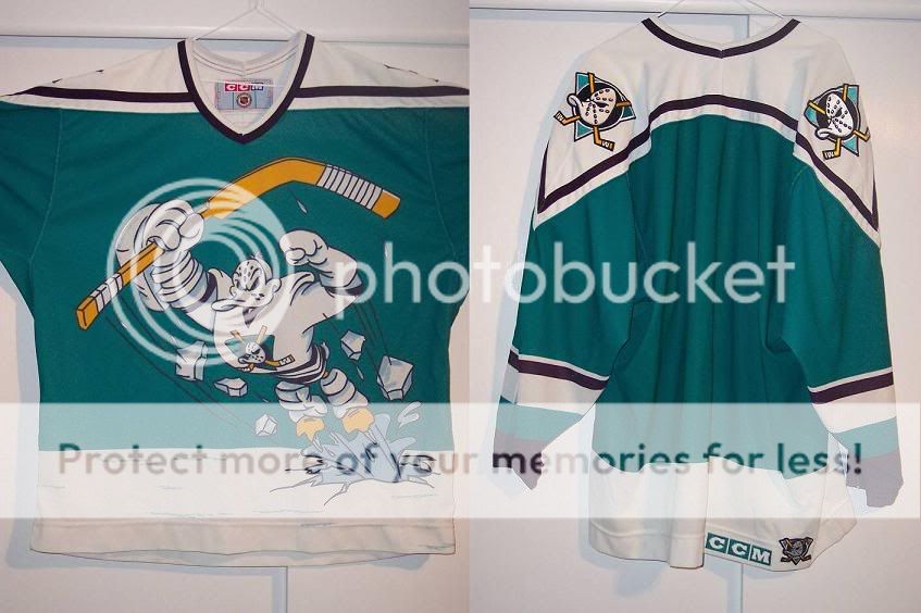
Going with the Ducks one would have been too easy.
This season, several teams have released brand new 3rd jersey designs. Some look better than the teams' actual jersey.


And then there is the Atlanta Thrashers. When I was in college, my roommates and I would say "that is so expansion" anytime we referred to a particular design, be it a sports jersey or the logo of a company. The expression implied that the particular item was ugly, confused and devoid of any tradition or implication of tradition. This is due to the fact that in the late 80's and early 90's, all the major sports leagues were expanding with reckless abandon and the uniforms reflected the aesthetic of the times. Ugly.

The first ESPN 2 logo... very expansion.

Meta-Expansion. An expansion team being expansion.
The Atlanta Thrashers 3rd jersey is so expansion.

Ug-ly. They look like jerseys left over from the XFL.
But back to the Kings. When I first saw the Kings 3rd jersey logo that was leaked on the internet, I got nervous...

But when you see it on a jersey, it looks great. The biggest improvement is that they made the crown smaller, so the LA really dominates the jersey. I can't wait to see them on actual NHL players this Saturday, and I'll be sure to provide photo documentation from the game.
All in all, I guess I'm just a traditionalist when it comes to hockey jerseys. The simplier the better.

Man, I love that jersey. I really do.

2 comments:
Just stumbled upon this blog the other day and gotta say, I love it. Best Kings blog of its kind. By far. Thanks much and keep up the good work.
Dave
Thanks for the kind words and keep commenting and coming back!
Post a Comment