Showing posts with label jerseys. Show all posts

Wednesday, December 10, 2008

Jersey Politics

I was reading the front section of the LA Times today (yes, I still do read Dead Tree Media) and I saw an 1/4 page ad for this:


Whatever your politics are, you have to agree... having a jersey based on a president being elected would be pretty sweet. I would have loved a Chester Arthur 21/81 jersey to wear around town. Is this a great country or what?


Look at the "08". Don't tell me that the new wave of NHL jerseys weren't the inspiration for it.


I went to check out the Xtreme Fanz website and saw that there is a Football, a Basketball and a "Women" option for the Obama jersey... but no ice hockey. So I emailed their customer service department and they informed me that they have no plans to offer a hockey style jersey. It seems that the sport of hockey was a part of this election year, more than any before. Some of that is obvious. But if the Obama 08 campaign was truly about change... isn't it about time we see an Obama hockey jersey for sale? I bet if McCain/Palin had won there would be one.


Saturday, November 22, 2008

Jersey Girl

This was a game that the Los Angeles Kings should have won. 18 year old Drew Doughty is a total stud. Blah, blah blah let's talk about that awesome new jersey!

Kings 3, Av's 4


Midway through the 2nd period,
Raitis Ivanans realizes that the Kings are wearing a new jersey.


Wow, what a great looking jersey. Even my Half Season Ticket Holder Buddy couldn't stop talking about it all night. But even better than the jersey itself, was the amazing show the Kings promo staff put on tonight.

First off, the main store, Team LA, was closed and this is what was outside:


You may be back in black. But I'm in red. So back away please.

A line had even formed outside the store to be the first to buy the jersey.


"Oh, no. This is for the 3rd jersey. The iPhone line is down there."

They were not letting anybody into the store until 7:34pm, the time that the Kings would skate onto the ice. Even the Kiosks stationed around the Staples Center were covered up.


Up in our seats, at 7:34pm the lights were dimmed and AC/DC's "Back in Black" came on the loudspeaker.


And then the Kings came out in the new jersey as Bailey waved a flag with the new logo feverishly.


The 3rd logo was everywhere. Including the scoreboard...


And on the Ice Girls...


And on Cartman...


Even the scoreboard graphics were treated with a black hue instead of the normal full color.


The 2 Kiosks around Staples opened... and were filled to the brim with 3rd logo merchandise.


Hmm, do you have anything with "Louisiana" on it?

The Team LA store was overloaded with new logo items. And yes, that jacket that was leaked online last week is real.


Perfect for rollerskating and chillin out in the 80's. Or in the 00's but with irony.

The store was filled with other merchandise that one might actually consider buying.


That's right. 18 year old Drew Doughty has his own player t-shirt.
You have arrived my friend. You have arrived.


And as far as the arena celebration... what is classier than an ice sculpture???


Answer: A chandelier is the only thing classier than an ice sculpture.

The jersey looks so great on the ice. Especially the white stripe at the bottom of the jersey. But the really great part is in the details. Check out Michal Handzus's helmet:


They are wearing the old "Kings" wordmark logo on their helmets from the Gretzky era. This is what the helmets look like normally:


A huge improvement. My one criticism is the number on the back. It's very big and even thought it has a silver trim, seeing it in person, the numbers looked very flat on the back of the jersey.


But that certainly didn't stop fans from buying the new 3rd jersey. It seemed like they were buying them by the dozen. Every few minutes fans would walk up to their seats in one of the new jerseys. Some already had custom numbering jobs. Like this one.


Wow, that woman's brand new jersey is already outdated.

LaBarbera? Really? Could there be a worse Kings player right now to put on the back of a brand new $300 jersey?


Found it!

That's right. She has seats right on the glass... and hands of stone on the back of her brand new $300 jersey. I really hope that is Kyle Calder's sister. Finally, as the fans exited Staples Center... we all got a little souvenir to take home.


This may be the only banner the Kings are raising for a while.

It was a fun night. It could have been better if the Kings had won, but with Phoenix and Dallas losing... I'll take the point. The jersey and all the celebration associated with it came together great. And I guarantee that the 3rd jersey will be the Kings main jersey within 2 years. Guarantee.

Wednesday, November 19, 2008

(New) New Jersey

NHL 3rd Jerseys are nothing more than extra money in NHL teams' pockets. They serve no purpose beyond getting fans excited about our favorite team playing in "something different" and then going out and buying that jersey. That being said... it has totally worked. I'm really excited about the Los Angeles Kings new 3rd jersey which has just been leaked on the internets.


The Kings will wear the new jerseys in a game this Saturday against the Colorado Avalanche, a game me and my Half Season Ticket Package buddy will be at.


I grew up in the era of Gretzky silver and black. The Purple and Gold uniforms were great, but with Wayne Gretzky in town, it was time for the Kings to forge a new identity. The Silver and Black were perfect. Simple, clean and a strange Chevy-logo crest on the front.

I can't believe they only went to 1 Stanley Cup Finals with that lineup.

The Kings changed their jerseys in 1998 to distance themselves from that Gretzky era (and Bruce McNall). I never warmed up to the jersey that Kings currently wear... a purple that looks like blue on television and silver glitter on the numbers. Not to mention the "Los Angeles" banner across the bottom. Or sunglasses on a lion.

Because sunglasses on a lion just makes sense.

Luckily, the Kings switched from that "Country Club" logo to the current Crown logo in 2002. But this is a post about 3rd jerseys, not the Kings current crappy jerseys. The 3rd jersey is a great opportunity for a NHL club to really make a statement with its uniform. Since 1995, the first year that teams used a 3rd jersey, there have been some greats:

Peter the Great jersey.

And some not so great.

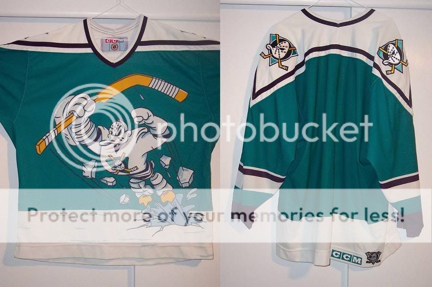
Going with the Ducks one would have been too easy.

This season, several teams have released brand new 3rd jersey designs. Some look better than the teams' actual jersey.


And then there is the Atlanta Thrashers. When I was in college, my roommates and I would say "that is so expansion" anytime we referred to a particular design, be it a sports jersey or the logo of a company. The expression implied that the particular item was ugly, confused and devoid of any tradition or implication of tradition. This is due to the fact that in the late 80's and early 90's, all the major sports leagues were expanding with reckless abandon and the uniforms reflected the aesthetic of the times. Ugly.


The first ESPN 2 logo... very expansion.


Meta-Expansion. An expansion team being expansion.

The Atlanta Thrashers 3rd jersey is so expansion.


Ug-ly. They look like jerseys left over from the XFL.

But back to the Kings. When I first saw the Kings 3rd jersey logo that was leaked on the internet, I got nervous...


But when you see it on a jersey, it looks great. The biggest improvement is that they made the crown smaller, so the LA really dominates the jersey. I can't wait to see them on actual NHL players this Saturday, and I'll be sure to provide photo documentation from the game.

All in all, I guess I'm just a traditionalist when it comes to hockey jerseys. The simplier the better.

Man, I love that jersey. I really do.